


If you work with Power BI (PBI), you have probably seen the highlighting functionality. Unlike filtering, highlighting does not remove any data from your visuals. It only highlights the related data within your visuals.
Often times, the data point which is highlighted goes away when exporting the PBI report as a PDF. This is particularly the case when we highlight the data point of a table with many rows.
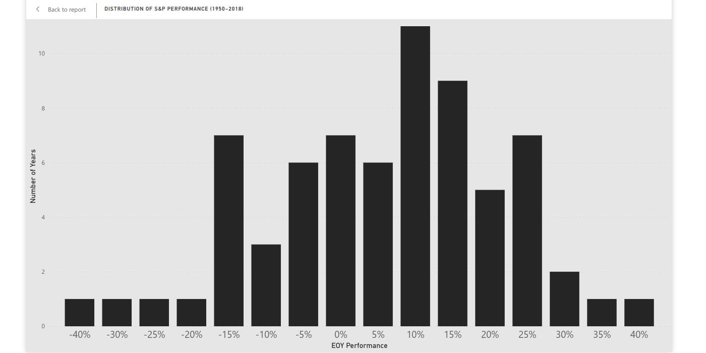
S&P 500 Performance (1950-2018)
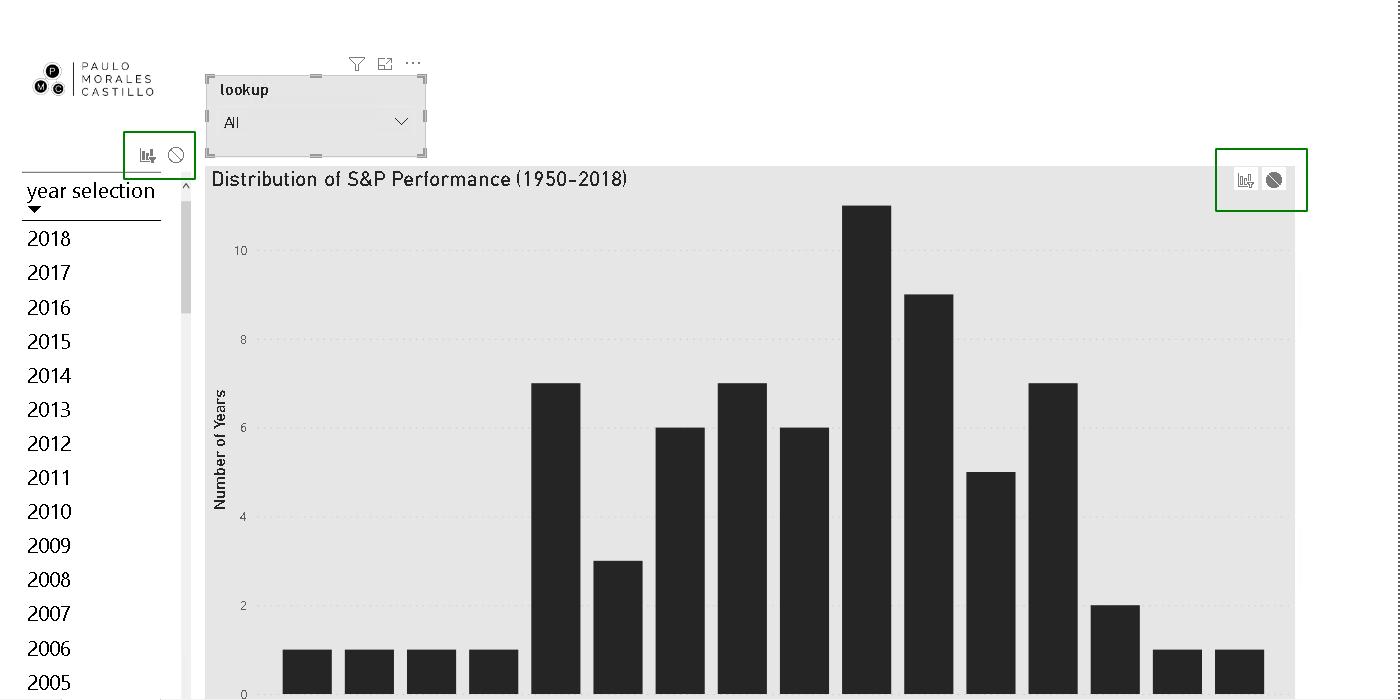
For example, consider a report showing the distribution of stock market performance. The data for this sample report is the daily observations for the S&P 500 between the years 1950 and 2018. This data set comes from the openintro package in R and is available here.
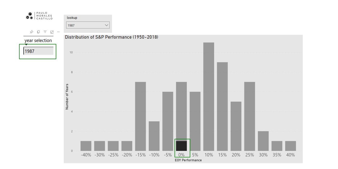
Say we would like to highlight the performance of year 1987. From the PBI Service, we highlight this year by selecting 1987 in the table.
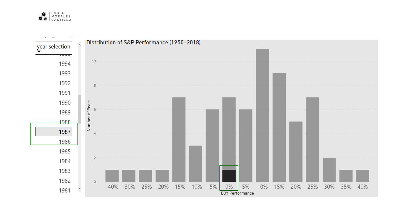
The highlight will show us that, for the year 1987, the S&P 500 had an end-of-year performance between 0% and 5%. As expected, the highlight does not remove any data from the distribution chart.
Now, say we would like to export these findings as a PDF and share it with colleagues. From the PBI Service, we then select Export>PDF>Export with Current Values>Only export current page>Export.
A quick inspection of the PDF file shows us the issue. The distribution remains as expected while the table is scrolled all the way up. It does not allow us to see the selection we originally made. Yikes!
The Work-Around
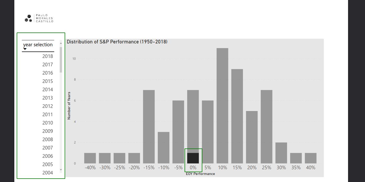
One of our clients had this issue with their report. The following is a work-around we were able to come up with. Firstly, from PBI Desktop, create a slicer visualization and include the year as field. Make it a drop-down slicer with a search bar.
Allow for multiple-selection by selecting Visualizations>Slicer settings>Multi-select with CTRL>on. Pro tip: The search bar option is only available if the field is of type text.
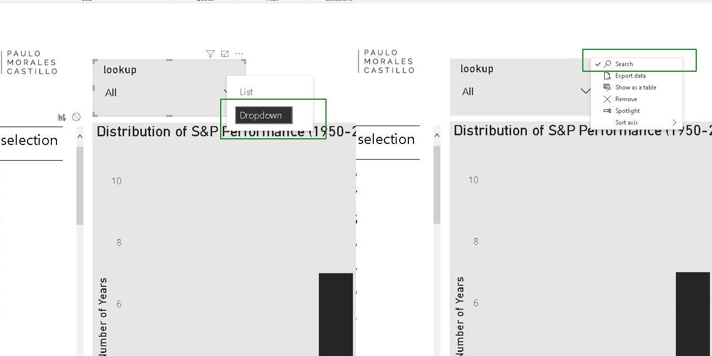
Afterwards, click on the slicer visual and go Format>Edit interactions. Leave interactions available only between the slicer and the table. Block all interactions between the slicer and the rest of visualizations.
The idea is to first use the slicer to filter the content of the table. Then, we use the table to highlight the distribution chart.
The Test
After publishing these changes, let us repeat the exercise above. First, we look for the year 1987 in the lookup slicer and select it. Then, select the year 1987 in the table.
Notice that this has the same effect as the attempt made earlier. Now, export to PDF.
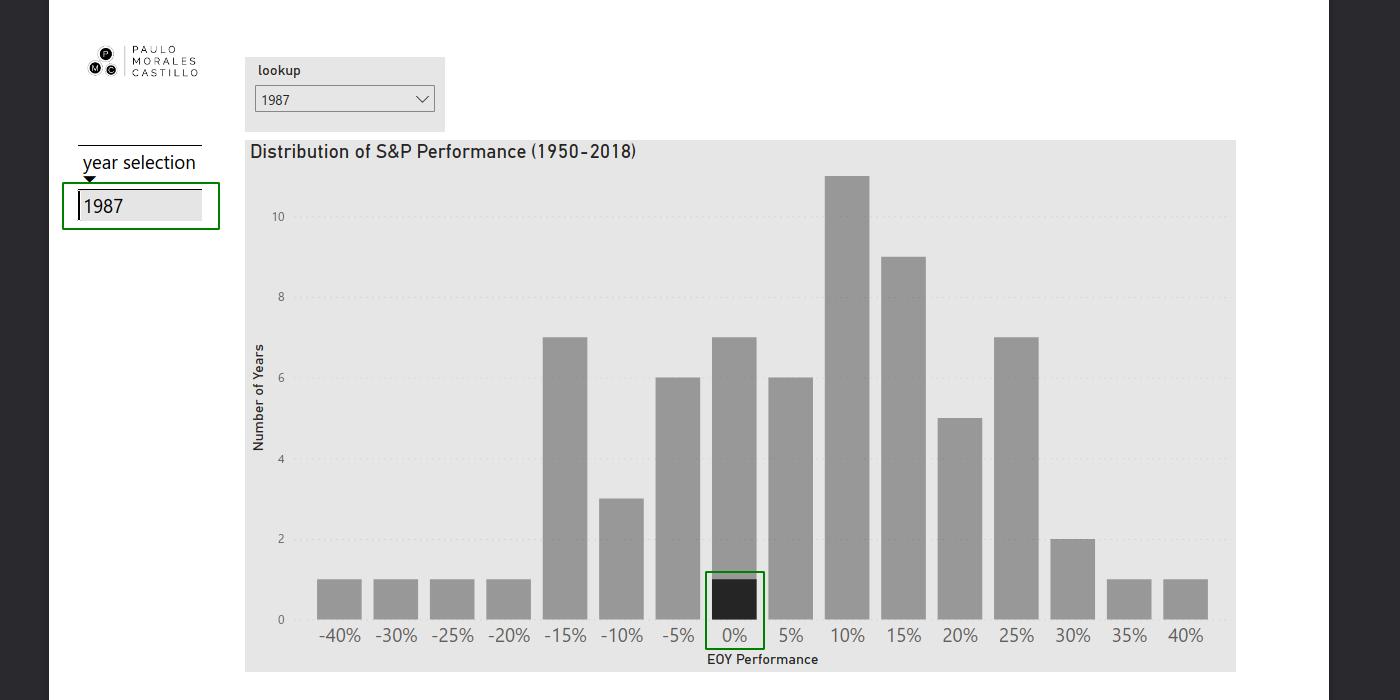
Voilà. We are now able to see the selection from the table and the highlight in the distribution chart.
Keep in mind that, the same procedure would apply to highlight multiple data points within the table. The sample report is available in GitHub.


